AI-Driven Clinical Support & Real-Time Behavior Insights for Educators
AI-Driven Clinical Support & Real-Time Behavior Insights for Educators

**This UX project was developed based on my direct experience working as a Registered Behavioral Therapist, where I identified and solved systemic issues through user-centered design.

Faster Collaboration & Real-Time Behavior Insights for Educators
OVERVIEW
PROBLEM
GOAL
Role
Product Designer
Timeline
12 months
Skills
UI/UX Design
User Research
Wireframing
Visual Designing
User Testing
Tools
Figma
Microsoft Teams
Miro
While working at Roselle Park School District, I identified three key challenges that hindered effective student behavioral interventions:
Reactive Triage
Lack of automated monitoring meant clinical crises were only identified after manual data review.
Manual Data Friction
The high "cognitive load" of manual data entry pulled staff from direct student observation and pairing.Collaborative Silos
Real-time behavior plan updates werent synced, leading to inconsistent program implementation.
Transform ABA data collection from a passive recording tool into a proactive clinical partner. By integrating AI-driven monitoring, I aimed to automate the 'Triage' process, ensuring that behavioral spikes and stagnation are flagged instantly, allowing clinicians to focus on high-impact interventions rather than manual trend analysis
Bridging behavioral expertise and AI to enable smarter, faster student support
Supporting Student Success with a Clinical Monitoring System & Real-Time Behavior Insights for Smarter Support
Supporting Student Success with a Clinical Monitoring System & Real-Time Behavior Insights for Smarter Support
Supporting Student Success with a Clinical Monitoring System & Real-Time Behavior Insights for Smarter Support
Role
Product Designer
Timeline
12 months
Skills
UI/UX Design
User Research
Wireframing
Prototyping
User Testing
Tools
Figma
Microsoft Teams
Miro
While working at Roselle Park School District, I identified three key challenges that hindered effective student behavioral interventions:
Reactive Triage
Lack of automated monitoring meant clinical crises were only identified after manual data review.
Manual Data Friction
The high "cognitive load" of manual data entry pulled staff from direct student observation and pairing.Collaborative Silos
Real-time behavior plan updates werent synced, leading to inconsistent program implementation.
Create a streamlined tool that fosters an environment of efficiecy by reducing steps, enabling real-time updates, and fostering stronger collaboration among educators, giving students the consistent support they need to thrive.
Transform ABA data collection from a passive recording tool into a proactive clinical partner. By integrating AI-driven monitoring, I aimed to automate the 'Triage' process, ensuring that behavioral spikes and stagnation are flagged instantly, allowing clinicians to focus on high-impact interventions rather than manual trend analysis
Bridging behavioral expertise and AI to enable smarter, faster student support
Role
Product Designer
Timeline
12 months
Skills
UI/UX Design
User Research
Wireframing
Prototyping
User Testing
Tools
Figma
Microsoft Teams
Miro
While working at Roselle Park School District, I identified three key challenges that hindered effective student interventions:
Lack of collaborative tools
Team members had a limited ability to contribute to or review behavior plans (BPs), making it more challenging to ensure students received consistent, high-quality care.
Cumbersome user experience
Accessing key information required too many steps, pulling staff away from real-time observations and active programming.Limited visibility into Behavioral Plan updates
Frequent behavior plan changes weren’t communicated in real time, leading to inconsistencies in program implementation or use of incorrect reinforcers.
Estimated to boost collaboration efficiency

Estimated to boost collaboration efficiency by 33%
Estimated to boost collaboration efficiency
Estimated to boost collaboration efficiency.
Success Metrics
Drove initiatives that guaranteed 100% team inclusivity

Drove initiatives that guaranteed 100% team inclusivity
Success Metrics
Success Metrics

Projected to reduce note-taking time
Projected to reduce note-taking time by 20%
Projected to reduce note-taking time
Projected to reduce note-taking time.
RESEARCH


RESEARCH
RESEARCH
RESEARCH
User Archetypes & Requirements
User Archetypes & Requirements
User Archetypes & Requirements
To gain a deeper understanding of how a typical user interacts with a platform similar to RethinkEd, I first needed to explore the roles and behaviors of the behavioral health team. I then created a user persona to capture their thoughts, goals, and pain points when using Roselle’s current system.

To gain a deeper understanding of how a typical user interacts with a platform similar to RethinkEd, I first needed to explore the roles and behaviors of the behavioral health team. I then created a user persona to capture their thoughts, goals, and pain points when using Roselle’s current system.
Over several weeks, I used the school’s existing system to collect program data by running BCBA-implemented programs, observing student behavior, and utilizing the required materials. During this process, I noticed that data collection consumed significant time, reducing opportunities for direct observation of student behavior.
Student X, Roselle Park Middle School
Student X, Roselle Park Middle School

Reducing Data Overload to Focus on Student Behavior Observation
Reducing Data Overload to Focus on Student Behavior Observation


Items used as reinforcement for good behavior
Items used as reinforcement for good behavior


Manual data collection sheets
Over several weeks, I used the school’s existing system to collect program data by running BCBA-implemented programs, observing student behavior, and utilizing the required materials. During this process, I noticed that data collection consumed significant time, reducing opportunities for direct observation of student behavior.
Manual data collection sheets
Manual data collection sheets
Student X, Roselle Park Middle School

Sugar free gum
Sugar free gum
Free drawing time
Free drawing time
Fidget toys
Fidget toys
Timesheet to mark disruptive behavior
ABC Datasheet tracking what happened before, during,
and after behaviors
Daily checklist sheet
Behavior tracking log
Fidget toys
Sugar free gum
Free drawing time
ABC Datasheet tracking what happened before, during, and after behaviors
Timesheet to mark disruptive behavior
ABC Datasheet tracking what happened before, during, and after behaviors
As I navigate through the current platform I notice many pain point such as:
The many steps needed to access the students "profile" to view their progress and changes
Lack of context of the contents being viewed on each page
Absence of collaborative tools throughout the website as a whole


Understanding the company’s current ABA data collection system
Understanding the company’s current ABA data collection system
Understanding the company’s current ABA data collection system
DESIGN
DESIGN
Started with initial website sketches to address pain points, enhance the user journey, and improve efficiency.


Created Initial sketches to streamline user journey

Created initial website sketches to address pain points, enhance the user journey, and improve efficiency
Designed Initial sketches to streamline user journey
Created Initial sketches to streamline user journey
Created Initial sketches to streamline user journey
Created initial website sketches to address pain points, enhance the user journey, and improve efficiency
Style Guide
Style Guide
What determined this particular design?
What determined this particular design?
Below is an overview of colors, typography and icons I used within the website to ensure consistency throughout the website.
The design process from lo-fi conceptual designs to hi-fi design solutions.


Lo-fi Design
Hi-fi Design
Hi-fi Design
Hi-fi Design

Below is an overview of tools used and steps take to created the design solution you will see at the end of this case study.
Below is an overview of colors, typography and icons I used within the website to ensure consistency throughout the website.
Below is an overview of colors, typography, and icons I used within the website to ensure consistency throughout the website.
The design process from lo-fi conceptual designs to hi-fi design solutions.
What determined this particular design?

Style Guide


Site Map
Site Map
Site Map
A broad view of what the journey through the site would look like for a user interacting with the updated platform.

A broad view of what the end-to-end experience looks like for a user interacting with the updated platform.
A broad view of what the journey through the site would look like for a user interacting with the updated platform.
What changes were made to the new design?
What changes were made to the new design?
Below is an overview of specific changes I made o each screen and why.
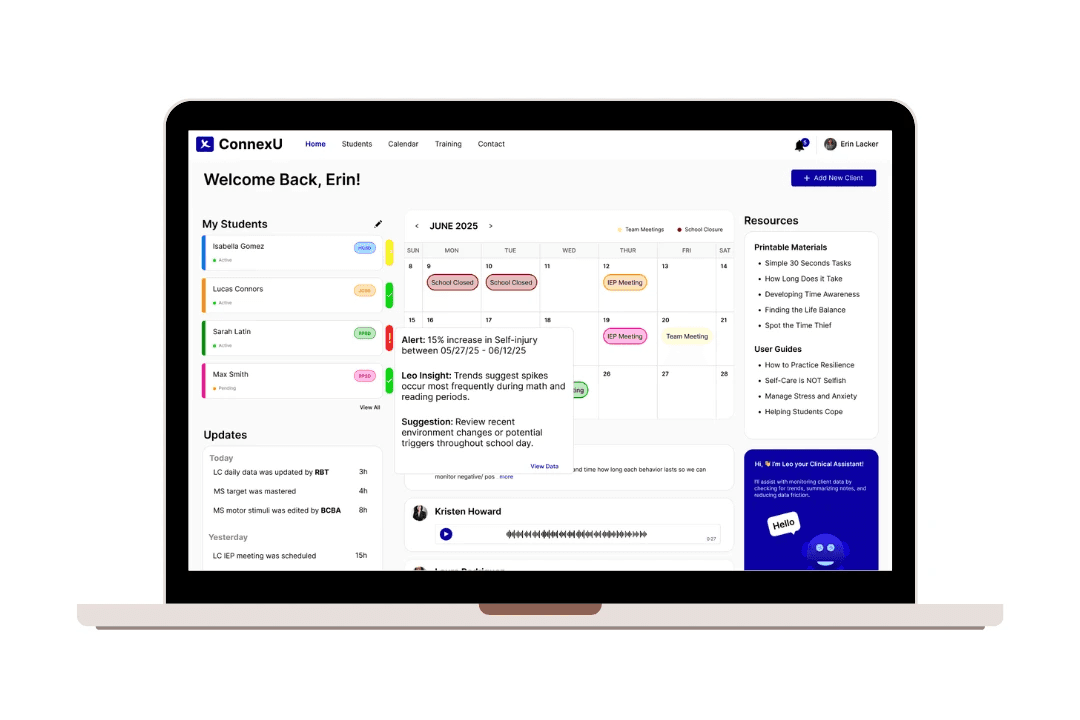
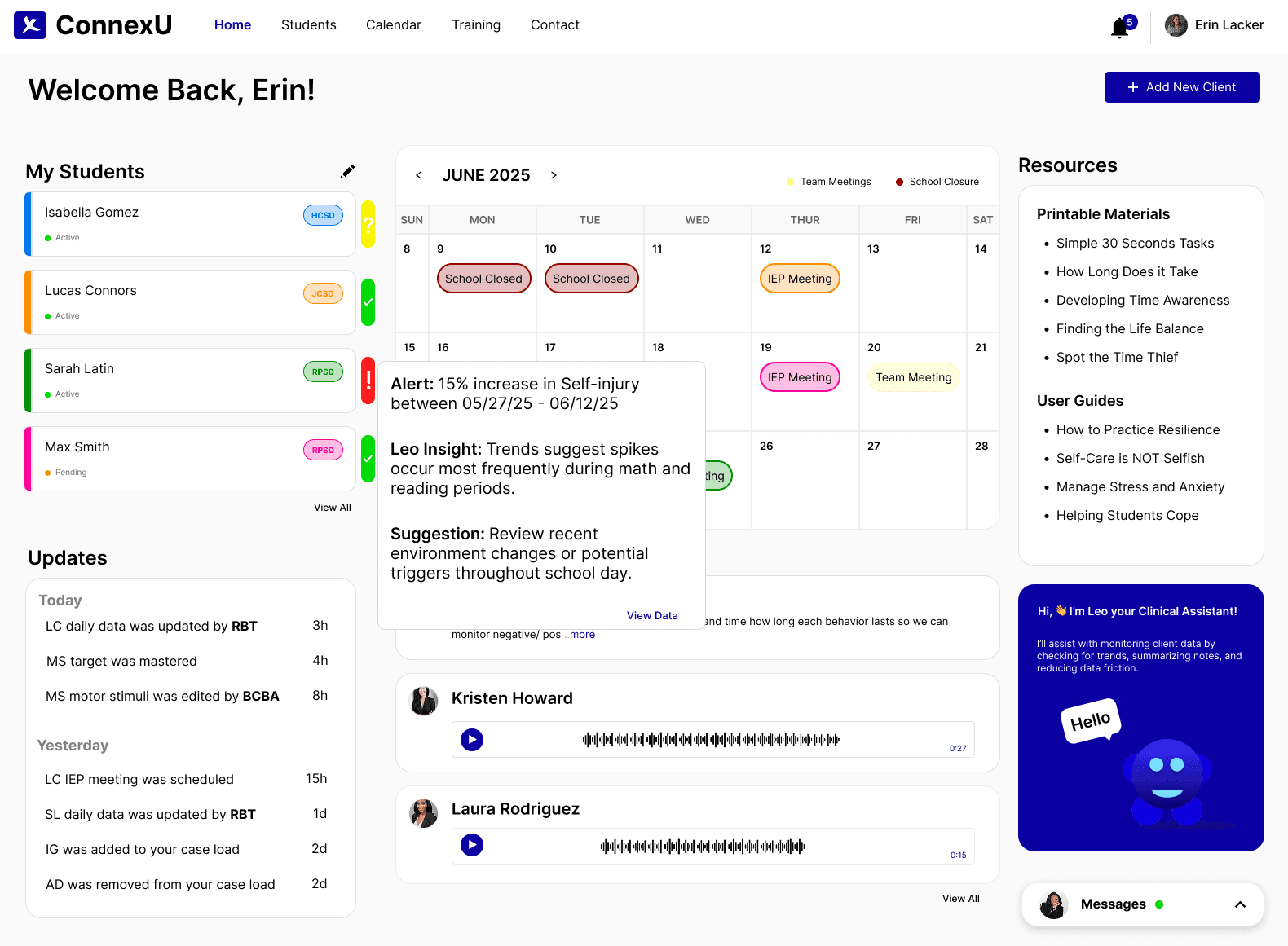
Live Team Calendar:
A full page dedicated to the calendar shared by the behavioral team where notes can be added in order to stay up to date with changes, cancelations and important information needed prior to meetings.
Centralized Hub:
Reduces cognitive load by aggregating student profiles, behavioral plans, and resources into a single-entry interface.
Centralized Hub:
Reduces cognitive load by aggregating student profiles, behavioral plans, and resources into a single-entry interface.
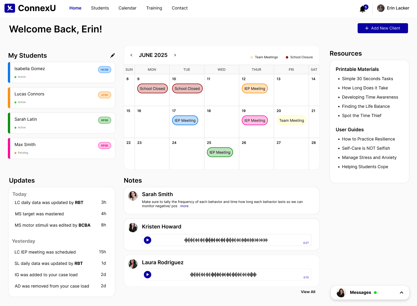
Real-time Updates:
All student profile updates automatically sync across the dashboard, ensuring full visibility, version control, and clear attribution to team members for better collaboration.
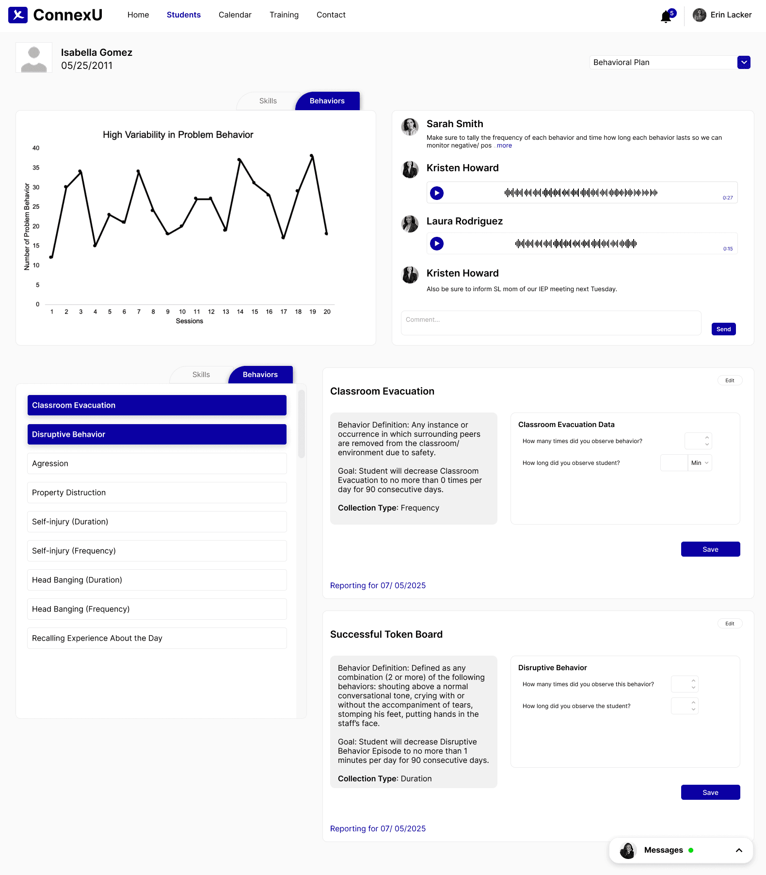
Hassle Free Data Collection:
Student profiles centralize notes and data, streamline the user journey, and enable real-time analysis to support data-driven behavioral interventions.
Hassle Free Data Collection:
Student profiles centralize notes and data, streamline the user journey, and enable real-time analysis to support data-driven behavioral interventions.
Hassle Free Data Collection:
Student profiles centralize notes and data, streamline the user journey, and enable real-time analysis to support data-driven behavioral interventions.
Below is an overview of specific changes I made o each screen and why.

"X's case manager forgot about our meeting again."
"X's case manager forgot about our meeting again."
Where it began….
Where it ended…
"It's much easier to log in and has a full overview of updates I've missed"
"We had zero staff miss behavior plan meetings all week"
"Debb can't get access to X's data chart from Tuesday."
"Debb can't get access to X's data chart from Tuesday."
The Comparison: Turning Moments of Friction into a Seamless Experience
The Comparison: Turning Moments of Friction into a Seamless Experience
The Comparison: Turning Moments of Friction into a Seamless Experience
"Did you get a chance to edit X's behavior plan yesterday?"
"Are we still having a EOY meeting with X's parents next week?"
"I'm completely up to date on X's data documentation"
"X's case manager forgot about our meeting again."
What went wrong…
"Are we still having a EOY meeting with X's parents next week?"
"Did you get a chance to edit X's behavior plan yesterday?"
"It's much easier to log in and has a full overview of updates I've missed"
"I'm completely up to date on X's data documentation"
"Debb can't get access to X's data chart from Tuesday."
"We had zero staff miss behavior plan meetings all week"
What went right…
SOLUTION
SOLUTION
The design built to tackle and eliminate challenges.
The design built to tackle and eliminate challenges.
Utilizing all the information collected throughout my design research and communicating with educators/therapists on the team, this is the concept I felt would address the lack of collaboration and the lost time working with students.
Utilizing all the information collected throughout my design research and communicating with people on the team this is the concept I felt would solve the user issues I stated.
Utilizing all the information collected throughout my design research and communicating with people on the team this is the concept I felt would solve the user issues I stated.
DESIGN
LEVERAGING AI
LEVERAGING AI
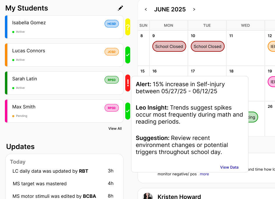
Leo automates data analysis, identifying statistical outliers and summarizing daily session notes into actionable clinical insights. This eliminates manual auditing and ensures data integrity across the care team.
To address the 'Data-to-Insight Gap,' I integrated an AI-driven analysis layer. This allows the system to automatically flag behavioral trends in real-time, reducing the 24-48 hours typically required for manual BCBA review.
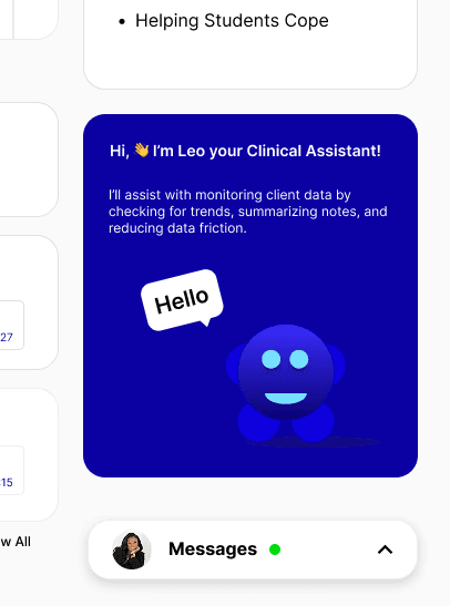
Leo acts as an intelligent clinical partner, providing real-time data synthesis and answering complex queries regarding client progress, compliance, and behavioral history.
To address the 'Data-to-Insight Gap,' I integrated an AI-driven analysis layer. This allows the system to automatically flag behavioral trends in real-time, reducing the 24-48 hours typically required for manual BCBA review.
To address the 'Data-to-Insight Gap,' I integrated an AI-driven analysis layer. This allows the system to automatically flag behavioral trends in real-time, reducing the 24-48 hours typically required for manual BCBA review.
Leo acts as an intelligent clinical partner, providing real-time data synthesis and answering complex queries regarding client progress, compliance, and behavioral history.
Leo acts as an intelligent clinical partner, providing real-time data synthesis and answering complex queries regarding client progress, compliance, and behavioral history.
Leo automates data analysis, identifying statistical outliers and summarizing daily session notes into actionable clinical insights. This eliminates manual auditing and ensures data integrity across the care team.
Leo automates data analysis, identifying statistical outliers and summarizing daily session notes into actionable clinical insights. This eliminates manual auditing and ensures data integrity across the care team.
A look at what users had to say about the tool
A look at what users had to say about the tool

"I really enjoyed the live note-taking where all parties can view updates. This makes it easier to keep everyone up to date on any changes made."
-Sarah P., Lead Behavioral Analyst

"Being able to check what the students' progress is while I'm working with other students within multiple school districts makes it easier to plan lessons."
-James T., Occupational Therapist

"The calendar tool that includes parents is so smart. That way, I don't have to reach out to each parent about meetings, and I won't get complaints about parents being unaware of meetings throughout the year."
-Vicky S., Inclusion Teacher
"I really enjoyed the live note-taking where all parties can view updates. This makes it easier to keep everyone up to date on any changes made."
-Sarah P., Lead Behavioral Analyst
"Being able to check what the students' progress is while I'm working with other students within multiple school districts makes it easier to plan lessons."
-James T., Occupational Therapist
"The calendar tool that includes parents is so smart. That way, I don't have to reach out to each parent about meetings, and I won't get complaints about parents being unaware of meetings throughout the year."
-Vicky S., Inclusion Teacher
A look at what users had to say about the tool
REFLECTION
REFLECTION
Collaboration Tools Are Crucial for System Efficiency
Designing for multiple stakeholders (teachers, behavioral staff, admins) requires features that support real-time collaboration and communication to avoid delays and miscommunication.Empathizing with Users Unlocks Better Design Decisions
Creating user personas and mapping journeys helped me understand the pain points behavioral health professionals face daily—allowing me to build solutions grounded in empathy.Simplicity in Navigation Matters
Too many steps in the original system led to user frustration and inefficiency. Streamlining the user flow was essential for improving the overall experience.
What I learned
Collaboration Tools Are Crucial for System Efficiency
Designing for multiple stakeholders (teachers, behavioral staff, admins) requires features that support real-time collaboration and communication to avoid delays and miscommunication.Empathizing with Users Unlocks Better Design Decisions
Creating user personas and mapping journeys helped me understand the pain points behavioral health professionals face daily—allowing me to build solutions grounded in empathy.Simplicity in Navigation Matters
Too many steps in the original system led to user frustration and inefficiency. Streamlining the user flow was essential for improving the overall experience.


